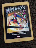
I think that the genius of the Kindle is that it does a few things very well, instead of many, many things, well or otherwise. It concentrates on getting reading material to you easily and quickly, presents that material in a fashion that's easy on the eyes, then gets out of your way so you can enjoy the material. There are no pings that announce arriving e-mail while you're reading a magazine article. No sidebar news items appearing while you're in the midst of a novel. No constant low-battery warnings. Just the simple elegance of a flat, neat slab that sends words your way, one article or story or novel at a time.
Any improvements in a Kindle 3 should therefore strengthen the philosophy behind the Kindle, not muck it up with tons of new features. Myself, I kind of like that Barnes and Noble's Nook lets you see a book's cover artwork in color on a small touchscreen separate from the e-ink screen. But I wouldn't say that a Kindle 3 has to have that. However, things I wouldn't mind seeing include the following:
How about more typeface choices, or- even better- having the Kindle duplicate the typeface used in the paper versions of the books it sells? That would be a small but nice touch.
An improved, less robotic text-to-speech function would be good, too. Right now I use text-to-speech to listen to some of my news blogs while driving home from work, which works fine, but I can't imagine using the function to listen to anything with actual characters, nuanced prose, etc.
Though currently perfectly acceptable, I wouldn't mind slightly better contrast between the screen's text and background. Blacker text over a whiter background, to be more specific.
Finally, without making the dimensions of the device any bigger, I think more of the Kindle's face should be devoted to the screen. While not making a K3 any bigger than the K2 (I think it's important not to sacrifice portability), the screen's "real estate" could easily be increased by 5% or so, even if they keep the traditional keyboard where it is now.
I have a few other ideas, but for now I'll just throw that first wave at you. What do you think the Kindle can stand to improve in future upgrades? And what things don't need to be changed at all?
Wednesday, February 3, 2010
Subscribe to:
Post Comments (Atom)


I think a soft tough keyboard and toggle switch are a quick easy advancement.
ReplyDeleteI'd love to see tough screen technology employed, but then you've got the additional problem of battery usage -- which is something that works very well right now.
A built in reading light from under a slightly raised lip at the top of the screen would be cool.
On another issue, have you notice the number of typos and slight format glitches in many othe the Kindle texts. Perhaps they are also in the regular texts, but I'm noticing them more on my kindle.
I agree with you on the reading light. Your way, or perhaps a recessed arm with a bulb on the end, that you can raise and point down at the screen, would work.
ReplyDeleteAnd yes... I notice the frequent typos & format glitches, too. Some people don't notice that stuff, and some are bothered by 'em. I'm in the latter camp (sounds like you are, too) and wish for a little more quality control.