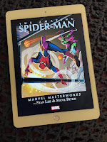
Well, I guess I wasn't the only person who was curious, because there are now several videos posted on YouTube that compare the iBooks app for the iPad with the Kindle app for the same device. Just do a search for Kindle app on iPad and take your pick of overviews. Myself, I think the apps are pretty evenly matched, with each app having only one or two mild advantages over the other one. In the end, what's important is that the Kindle app is spiffy enough that I won't resent having to use it if I want to employ Whispersync to jump between my Kindle and my future iPad (honestly, my wife says I can buy one) when reading a particular book.
And one final thought for those of you who absolutely hate the idea of a backlit screen to read ebooks: the Kindle app on the iPad (and, I'm assuming, the iBooks app) allows the reader to dial up or dial down the brightness level of the background. Which, in the demonstrations I watched, really seems to make a difference. When the brightness is turned down, the page and words look much less harsh than a fully-bright screen. Relaxing, even. Backlight haters may want to keep an open mind.
Wednesday, April 7, 2010
Subscribe to:
Post Comments (Atom)


No comments:
Post a Comment